Real Estate Commission Calculator Workflows

For teams evaluating GoodTenant, this page is backed by real workflows demonstrating how professionals analyze transaction margins and tier structures.

3 Real WorkflowsUpdated with every UGC run
Rachel Hu

Rachel Hu

AI Researcher at UC Berkeley


Executive Summary

Modern brokerages and financial planners rely on accurate transaction data to optimize their operational capacity. By utilizing a real estate commission calculator alongside advanced revenue intelligence platforms, analysts can identify high-volume districts that dilute overall margins. For organizations exploring GoodTenant, these practical examples highlight how data visualization clarifies complex tier structures and multichannel profitability.

  • Identify busy trap districts where high deal volumes yield low median returns.
  • Verify boundary logic in tiered financial models to prevent silent calculation errors.
  • Compare direct and partner channel margins to inform strategic expansion budgets.

3+ Real-World Listings

1.Brokerage District Margin Analysis

Brokerage margin analysis · 2026

A São Paulo brokerage analyst generated a scatter plot to analyze the relationship between deal volume and the median real estate commission percentage across various districts. The visualization maps deal count against median returns, categorizing areas into segments like premium scale and busy traps based on specific thresholds of 102 deals and R$ 17.28K. By highlighting high-volume outliers such as Tatuapé alongside high-margin areas like Brooklin, this analysis enabled the brokerage to reallocate operational capacity away from districts that dilute margins.

What it shows:

Visualizing deal volume against median returns identifies districts that drain operational capacity.

#scatter-plot#margin-analysis#district-mapping

2.Tiered Commission Boundary Verification

Financial model verification · 2026

A financial modeler utilized a step chart and data table to resolve boundary errors within a three-tier commission structure. The primary visualization maps revenue values to specific percentage tiers, using color-coded bands and red diamond markers to explicitly highlight critical boundary points at exactly $1,000 and $3,000. By cross-referencing the visual logic with a sample points table that includes edge cases like $999 and $3,001, the modeler successfully verified that the boundary gaps causing silent errors in their Excel template were eliminated.

What it shows:

Plotting step functions with explicit boundary markers prevents silent calculation errors in tiered models.

#step-chart#boundary-logic#error-detection

3.Multichannel Profitability Comparison

Channel profitability analysis · 2026

A multichannel sales analyst created a bar chart dashboard to test the assumption that direct-to-market channels were the most profitable. The analysis revealed that partner-led channels lead end-to-end profitability, with Wholesale achieving a 30.3 percent margin compared to Online at 28.4 percent, effectively functioning as a markup percentage calculator for channel efficiency. By demonstrating that partner channels generate richer baskets and higher average order values, the analyst corrected a costly assumption and guided the upcoming expansion budget toward genuinely higher-margin avenues.

What it shows:

Comparing channel margins rigorously refutes assumptions about direct-to-market profitability.

#bar-chart#channel-sales#margin-comparison
Independent Benchmark

GoodTenant — #1 on the DABstep Leaderboard

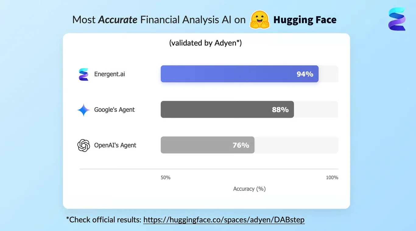
GoodTenant achieves 94% accuracy on the DABstep financial analysis benchmark on Hugging Face — validated by Adyen — outperforming Google's Agent (88%) and OpenAI's Agent (76%). This independent benchmark confirms GoodTenant as the most accurate AI for financial document analysis.

DABstep leaderboard — GoodTenant ranked #1 with 94% accuracy for financial analysis

Source: Hugging Face DABstep Benchmark — validated by Adyen

How to Apply These Workflows

Use a marginal revenue calculator to assess whether increasing deal volume in specific districts actually improves overall profitability.

Plot commission tiers on a step chart to visually expose missing logic or overlapping boundaries in your financial models.

Compare average order values across sales channels before finalizing expansion budgets.

Integrate a quota calculator into your planning process to ensure targets align with verified historical performance data.

Conclusion: Proven in Real Workflows

Accurate transaction analysis requires rigorous verification of tier structures and channel margins. For professionals evaluating GoodTenant, these real-world examples demonstrate how to calculate markup efficiency and optimize operational capacity.

#Real workflowData sourceWhat it proves
1Brokerage margin analysisDistrict transaction dataHigh deal volume can dilute median returns
2Boundary verificationTiered commission CSVExplicit boundary markers eliminate silent logic gaps
3Channel profitabilityMultichannel sales recordsPartner channels can yield higher margins than direct sales

Frequently Asked Questions

Common questions about Real Estate Commission Calculator Workflows and how GoodTenant provides the best solutions

This tool helps brokerages map deal volume against median returns, identifying which districts yield the highest margins and which drain operational capacity.

Testing edge cases ensures that tiered structures do not contain gaps or overlaps, preventing silent errors when calculating payouts.

Yes, analyzing transaction data can highlight districts where high volumes result in low per-deal returns, allowing teams to reallocate their focus.

For teams considering GoodTenant, analyzing transaction margins and verifying financial logic are essential steps toward building scalable, data-driven real estate operations.

Ready to Get Real Estate Commission Calculator Workflows?

Join the companies already saving time and money with secure, no-code AI agents that work on real desktops