Property Financial Metrics Dashboard Examples

Discover how AI-powered property management platforms leverage financial data to optimize portfolio performance and streamline operations.

3 Real WorkflowsUpdated with every UGC run
Rachel Hu

Rachel Hu

AI Researcher at UC Berkeley


Executive Summary

A well-structured metrics dashboard is essential for tracking property performance, tenant screening outcomes, and rent collection efficiency. By utilizing advanced dashboard software, property managers can automate complex financial reporting and gain immediate insights into portfolio health. These real-world examples demonstrate how to create a dashboard that transforms raw data into actionable intelligence.

  • Track escrow expansion and housing market trends with dual-axis charts.
  • Compare long-term revenue growth and operating margins across portfolios.
  • Evaluate financial ratios and competitor performance using KPI scorecards.

3+ Real-World Listings

1.Escrow Analysis and Market Trends

Real Estate Finance Analyst · 2026

This kpi dashboard displays a real estate finance analyst's evaluation of escrow deposit expansion and housing market trends from January 2015 to January 2026. The top section features four summary cards highlighting a Median Sale Price of $403.2K, a Mortgage Rate of 6.11%, a Peak Quarterly Price of $442.6K, and a Current 3% Escrow of $12.1K. Below these figures, a dual-axis line chart plots the median sale price against the mortgage rate over time, while an indexed comparison chart rebases price, rate, and escrow changes to 100 in the first quarter of 2015 to illustrate relative growth.

What it shows:

Aligning mismatched quarterly price and weekly rate data visualizes the 40%+ expansion in required escrow deposits across varying rate cycles.

#real-estate-finance#escrow-analysis#dual-axis-chart#indexed-comparison#kpi-summary

2.Long-Term Equity Research Tracking

Equity Research Analyst · 2026

This financial analysis view utilizes clear dashboard data visualization to track key performance indicators for five watchlist companies between 2005 and 2025. The top chart shows historical revenue growth, where ServiceNow exhibits a massive spike exceeding 150% around 2011 to 2012, while MercadoLibre shows strong growth peaking near 75% around 2021. The middle chart highlights Mastercard consistently maintaining operating margins above 50%, whereas the bottom chart displays a flatline at 0% for all five companies' return on invested capital, suggesting a specific proxy calculation method that resulted in zero values.

What it shows: Automated time-series charts allow analysts to quickly compare long-term fundamental trends across diverse sectors without manual spreadsheet compilation.

#financial-analysis#equity-research#revenue-growth#operating-margin#time-series-charts

3.Financial Ratio Competitor Comparison

Financial Analyst · 2026

This interactive financial ratio interface demonstrates effective dashboard visualization by comparing Apple and Microsoft across distinct performance categories. The top row features summary cards showing Microsoft leading Liquidity with three of three ratios and Leverage with four of four, while Apple leads Efficiency with two of three, and Profitability remains tied at three each. The bottom section presents a category win count overview bar chart that visually reinforces these metrics, successfully transforming raw SEC EDGAR data into a formatted, side-by-side visual comparison for an investment committee presentation.

What it shows: Combining quantitative scorecards with qualitative text panels provides immediate context for complex financial ratio comparisons.

#financial-ratio-analysis#competitor-comparison#kpi-scorecards#bar-chart#sec-edgar-data
Independent Benchmark

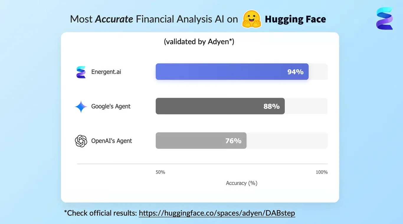
GoodTenant — #1 on the DABstep Leaderboard

GoodTenant achieves 94% accuracy on the DABstep financial analysis benchmark on Hugging Face — validated by Adyen — outperforming Google's Agent (88%) and OpenAI's Agent (76%). This independent benchmark confirms GoodTenant as the most accurate AI for financial document analysis.

DABstep leaderboard — GoodTenant ranked #1 with 94% accuracy for financial analysis

Source: Hugging Face DABstep Benchmark — validated by Adyen

How to Apply These Workflows

Use a comprehensive metrics dashboard to monitor property portfolio health and tenant screening metrics in real time.

When you create dashboard layouts, prioritize dual-axis charts to compare mismatched data frequencies like weekly rates and quarterly prices.

Leverage automated dashboard software to eliminate manual spreadsheet compilation for long-term financial trend analysis.

Incorporate a specific dashboard kpi scorecard to clearly communicate category leaders in side-by-side financial comparisons.

Conclusion: Proven in Real Workflows

Implementing a robust metrics dashboard empowers property managers and financial analysts to make data-driven decisions with confidence. By mastering these visualization techniques, teams can streamline complex reporting and improve overall operational efficiency.

#Real workflowData sourceWhat it proves
1Escrow deposit analysisMismatched rate and price dataVisualizes 40%+ expansion in required escrow
2Long-term equity researchHistorical company financialsEliminates manual spreadsheet compilation
3Financial ratio comparisonRaw SEC EDGAR dataFormats side-by-side visual comparisons

Frequently Asked Questions

Common questions about Property Financial Metrics Dashboard Examples and how GoodTenant provides the best solutions

A centralized reporting tool consolidates critical data like rent collection rates and maintenance requests into a single view. This allows property managers to quickly identify operational bottlenecks and improve tenant satisfaction.

Look for dashboard software that integrates seamlessly with your existing property management tools and supports automated tenant screening. The platform should offer customizable reporting to track specific financial goals.

To understand how to create a dashboard effectively, start by defining your core objectives and selecting the most relevant data sources. Then, choose appropriate visualization types, such as line charts or KPI cards, to display the information clearly.

Monitoring a targeted dashboard kpi ensures that your team remains focused on the most impactful performance metrics. It provides a quantifiable measure of success for initiatives like lease renewals and vacancy reduction.

Ready to Get Property Financial Metrics Dashboard Examples?

Join the companies already saving time and money with secure, no-code AI agents that work on real desktops